enermap
A mapping platform that helps local officials make informed energy decisions.
Rotate your screen to portrait mode
If the page doesn't adapt, reload it
Hybrid UI/UX & front-end profile, I turn your product vision into high-performing interfaces, from graphic design through to technical integration.
With 15 years of experience,I bridge the gap between design and development.
By building scalable design systems, I speed up delivery cycles and improve the final product's quality.
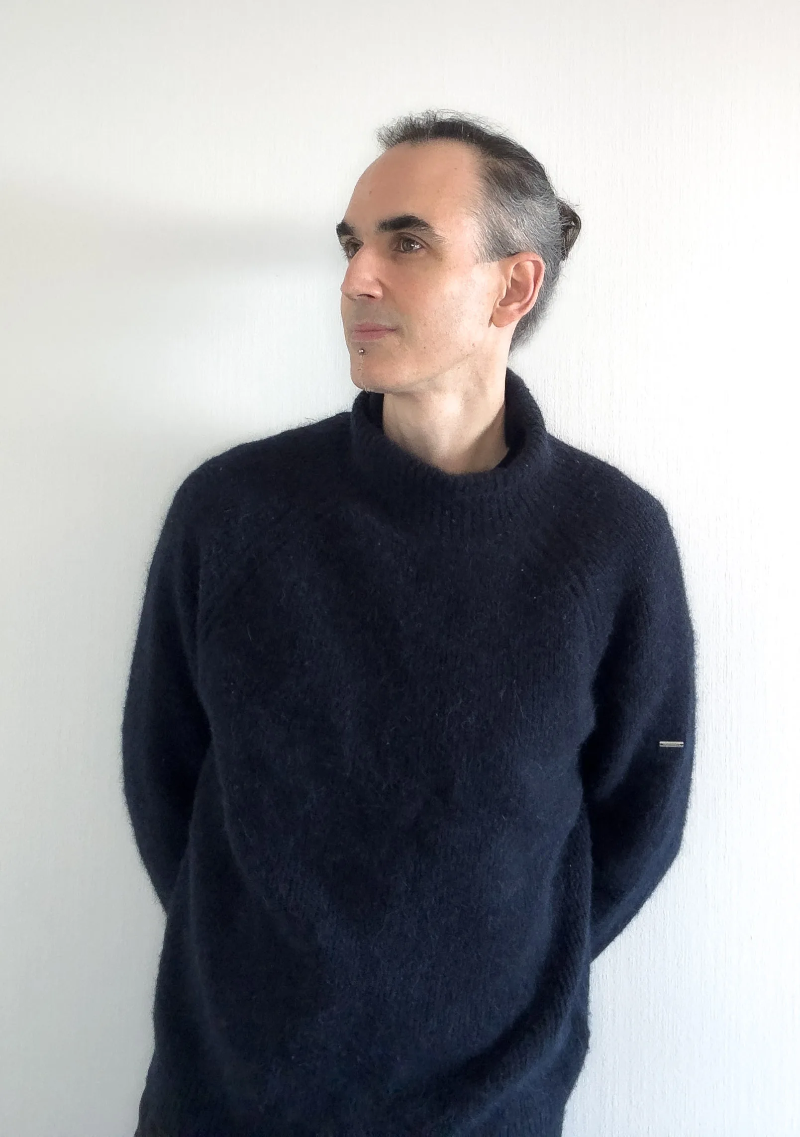
Originally specialised in building e-commerce platforms at an agency, I grew my expertise toward a more cross-functional Product Design role.
My dual UI/UX and front-end skillset is the common thread of my career: it lets me design complex interfaces while guaranteeing their technical feasibility.
Today, as a Hybrid UI/UX Lead in the geo-digital sector, I handle the design of feature evolutions for a business mapping solution.
Beyond hands-on work, my hybrid profile puts me at the center of the collaboration between UI/UX and development. Day to day, I define the right methods and share them with the Design and Front-End teams to streamline production processes.
Analysis of current data and feedback (clients, users) to identify pain points.
Using AI to generate and challenge user scenarios, build synthetic personas, and explore as many creative directions as possible.
Graphic design of the site’s various screens, based on the data gathered.
Mapping every component built into a design system.
Pixel-perfect interface integration. Translating design systems into design tokens and AI-assisted front-end implementation.
Whether it's user needs or team constraints (PMs, developers), I focus on understanding everyone's stakes to find the most fitting solutions.
A mapping platform that helps local officials make informed energy decisions.
A marketing platform for the Île-de-France region focused on driving contact requests.
A mapping data display solution for local authorities and territorial stakeholders.
Design and ship a mapping platform that helps local officials make energy decisions in 4 months — from Figma to production code, with AI as a co-pilot.
| Item | Detail |
|---|---|
| Product | EnerMap — public web platform for energy decision support |
| Client | ENGIE (Parliamentary & Territorial Relations Department) + SIRADEL |
| For whom | Local officials, EPCIs, municipalities — secondarily ENGIE business developers |
| My role | Lead UI/UX & Front-End Integration |
| Team | ~8 people — Head of Design, Project Manager, 1 back-end dev, 1 back/front dev, 3-4 data engineers, me |
| Stack | Figma · MCP Figma → Code · Angular · Tailwind · AI (Claude / UX Pilot) |
| Timeline | October 2025 → January 2026 (≈ 4 months) |
| Coverage | Every municipality in France |
| Live | enermap.engie.fr |
Ahead of the municipal elections, towns are setting their energy roadmap for the next 6 years.
But between regulatory complexity (PCAET, SRADDET, SCoT, PLUi…), the diversity of energy sources, and climate pressure, local officials have no simple tool to make objective choices.
On the public side : 81 % of French people support installing renewable energy infrastructure near their homes, 68 % want to see it accelerate over the next 5 years (IFOP/ENGIE study, May 2025).
The brief's complexity came down to a triple requirement :
Honest note
The artefacts below (personas, journeys, interview questions) are an after-the-fact reconstruction to formalise the approach. On this project, the needs analysis was carried out iteratively between the client (ENGIE), SIRADEL, and the editorial agency Ekno. I did not personally conduct user interviews.

Hélène, 52,Deputy Mayor for Ecological Transition

Marc, 38,ENGIE Regional Business Developer
Hypothetical interview questions
Had we been able to interview a dozen officials beforehand, here are the questions I would have asked :
Simplified user journey

→ Hélène searches “my town renewable energy” on Google, lands on EnerMap
→ Reads the “Understanding” page to grasp the role of local authorities

→ Types her town's name into the search bar

→ Overview : climate impact + potential by energy type

→ Clicks “Solar potential” to see the map of eligible zones

→ Screenshot or URL sent to her team / to the CEO (DGS)
This is the core of what I brought to this project, and the reason we hit the deadline. I was able to bridge design and code myself, integrating designs and components directly from the Figma frames, with AI as a co-pilot.





short loops (iterations)
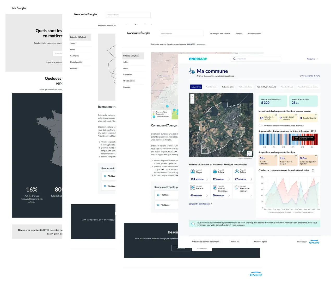
The site could be shown at the Salon des Maires while still in development. Officials walked around with an iPad to show it to their peers — which accelerated institutional buzz and led to a presentation at ENGIE's COMEX (executive committee).
I picked three decisions that feel most representative of the UX work, each with a measurable effect on usage.
5.1 — Editorial → tool architecture
A raw mapping tool loses a non-specialist official in 30 seconds. Conversely, an editorial site with no tool gives no way to take action.
Structure the journey into two successive stages, embodied by the home page's 4 entry points :
| Understand | Identify | Act | Fund |
|---|---|---|---|
| Editorial pages — education on the role of local authorities | Town search + detailed profile | Editorial pages — steps of a project | Editorial pages — funding levers |
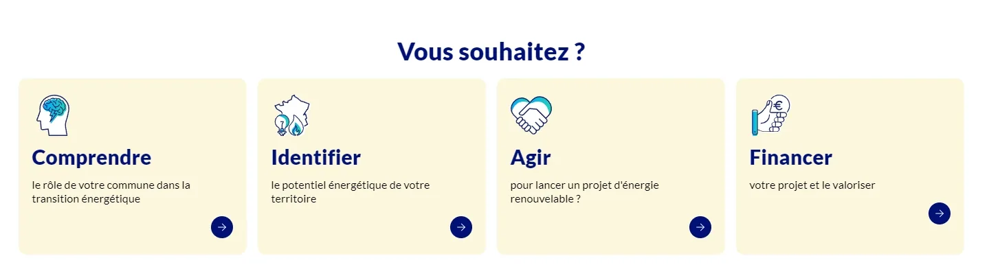
The untrained official is reassured first by the editorial content, while the seasoned official goes straight to the search bar. Both profiles are served without fragmenting the interface.
5.2 — Search bar in the hero, no menu
A visitor arriving on EnerMap has a town name in mind, not a navigation intent.
Place the search bar at the center of the hero, as the first interactive element. No dropdown menu, no mega menu. A smart autocomplete (city / EPCI / postcode) that resolves ambiguity on the fly.
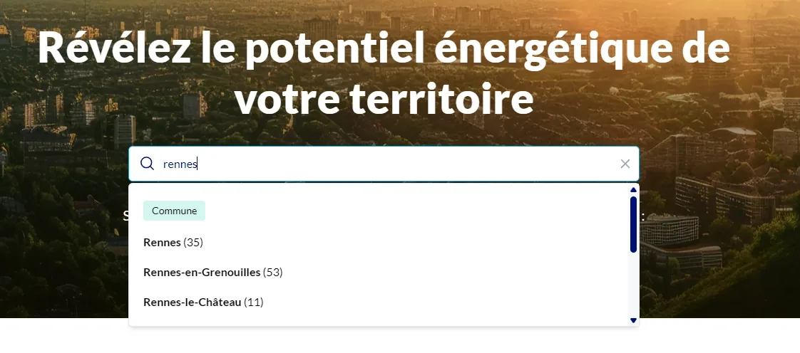
Less than 2 seconds between arrival and the first useful piece of data. The “Resources” menu in the top right stays discreet for those looking for editorial pages.
5.3 — Semantic color coding on the town profile
A town's profile shows around twenty indicators (population, climate, potential by energy type, surfaces…). Without visual hierarchy, the official disengages.
A color code by information family, defined once in the design system and applied consistently everywhere :
Green / turquoise — contextual data (population, area, land available)
Beige — climate change impacts (heatwaves, tropical nights, hail)
Peach — adaptation levers (tree canopy, artificialised land, greening)
White — key KPIs and methodology indicators
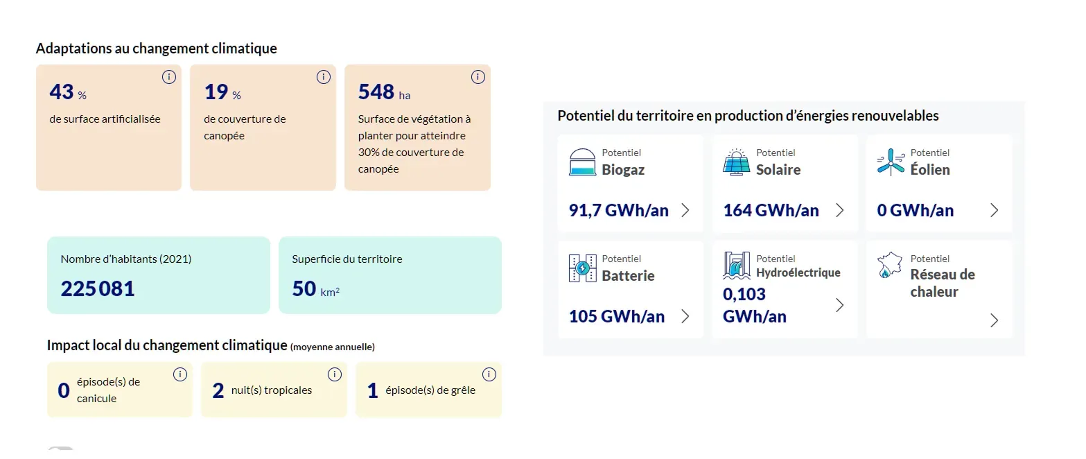
An official can scan the page without reading the labels. The brain identifies “families” first, then detail. And it stays consistent between the overview and the detail views (solar potential, wind, etc.).
Hard results
Oct 2025 → Jan 2026, ≈ 4 months
Every municipality from launch
Officials navigating on iPad, site still in development
Project escalated to the highest level of management
Comms campaign ≈ €150 k, equivalent to the production budget
“First version” banner publicly stated on the live site
Three lessons
01 — On this project, removing the boundary between design and integration was an accelerator. It became possible to eliminate an entire cycle of dev loops. Client changes went from mockup to code the same day (or within a few days for more complex feedback).
02 — AI and MCP change the nature of design tasks, not their value. What becomes automatable (tokens, atomic components, base CSS) frees up time for what isn't : understanding the user, arbitrating an information hierarchy, defending a data-viz choice.
03 — The design system industrialises design patterns but doesn't replace human decisions. Semantic color coding, numeric equivalences (“164 GWh/year = the consumption of 71,930 residents”), warming stripes — every visual convention is first an editorial decision. The design system makes it consistent at scale.
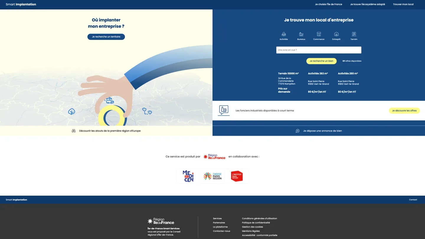
A real-estate platform for businesses across the Île-de-France region.
Goal: evolve Smart Implantation into a territorial marketing site while preserving its core features.
| Item | Detail |
|---|---|
| Product | Smart Implantation — a platform promoting the Île-de-France region to businesses looking to set up there |
| Client | Île-de-France Region (Île-de-France Smart Services) · L’Institut Paris Region · Medicen · Choose Paris Region |
| Target audience | Startups and industrial SMEs (10-200 people) looking to set up or relocate in the Île-de-France region, in strategic sectors (health, aerospace, renewable energy, sustainable mobility, agri-food…) |
| My role | UI/UX Designer + Front-End Integration |
| Team | 5 people: project manager, Head of Design (advisory), front-end dev (map data binding), ops (deployment), me |
| Stack | Figma · MCP Figma → Code · GSAP (motion) · Angular · Tailwind · AI (Claude / UX Pilot) |
| Upstream scoping | Needs assessment report (by Onepoint, March 2025) |
| Timeline | Winter 2025/26 → summer 2026 |
| DS | Smart Services / IDF Design System (mandated, with some flexibility) |
| Scope | Full redesign of an existing, live platform |
| Current site | smartimplantation.smartidf.services |
Smart Implantation has been live since 2021. Four years after launch, the client's assessment is clear : the service has not met its performance and adoption targets. Every company interviewed during scoping confirms it — the platform is little known, little used, and seen as ill-suited to the needs of the industrial sector. On the UX side, friction points piled up :
What was there
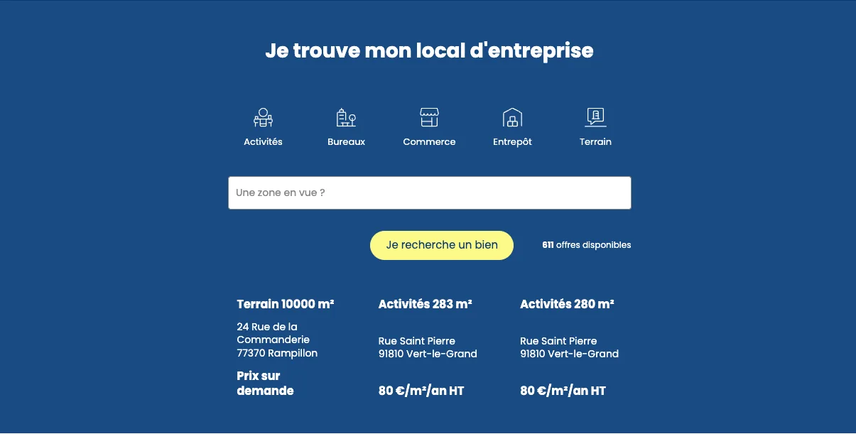
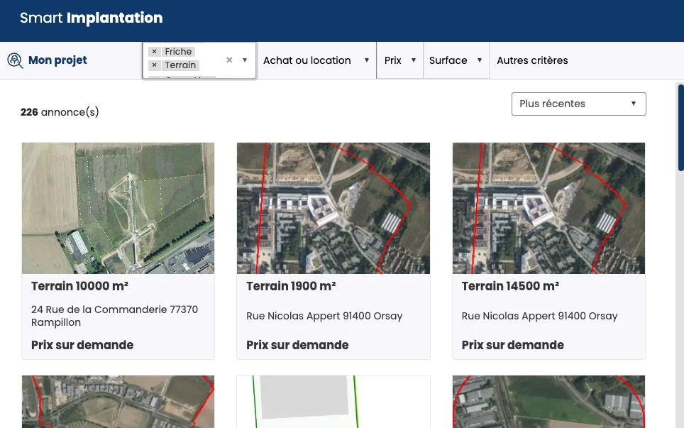
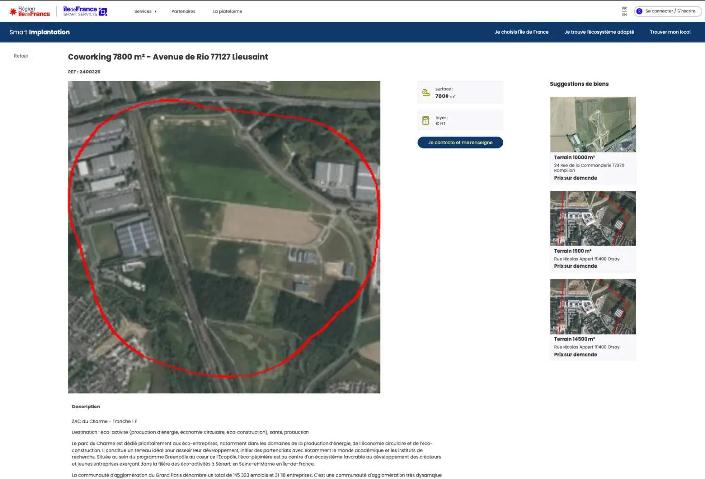

A study carried out by an external agency (Onepoint) laid out three scenarios :
Scenario 2bis is the one that was selected.
Shift the experience from a utility tool to a territorial marketing site, where Île-de-France is showcased as Europe's 2nd-largest industrial region.
Three lines of tension
Getting every decision validated across the Île-de-France Region, its communications team, and partners (Medicen, Choose Paris Region, Institut Paris Region), whose interests sometimes diverge.
Shifting from a transactional logic ("fill this in to earn the right to see") toward a conversion funnel : impression → desire → contact.
Preserving the interactive map and its filters (the core business value) while weaving them into a more narrative, more fluid journey.
Honest note
The personas and user journey below are an after-the-fact reconstruction. On this project, user interviews were conducted upstream by an external agency (Onepoint) (8 interviews with entrepreneurs and target stakeholders, reported in the March 2025 report). I used these materials to formalize the personas — I did not conduct interviews myself.

Startup/industrial SME leader (10-50 people)

Head of development at a more established company (100-200 people)
Criteria that weigh on the decision
Scoping distinguishes between "hard" criteria (mandatory) and "soft" criteria (optional). This hierarchy guides the design of the listing sheet — which data belongs at the top level, and which matters less.
| "Hard" criteria (mandatory) | "Soft" criteria (optional) |
|---|---|
| Rent and charges · Transport access (RER/metro) · Technical capacity (ceiling height, ICPE) · Modularity · Proximity to residential areas · Contractual flexibility (short-term leases) | Local amenities · Urban environment · Proximity to a sector cluster · Area visibility · Food and services (childcare, shops) |
Hypothetical interview questions
Had we been able to interview a dozen decision-makers upstream :
Simplified user journey

→ The business leader arrives via a partner link or a LinkedIn search
→ Zoom from the world → IDF — "Île-de-France, a land of industry and innovation"
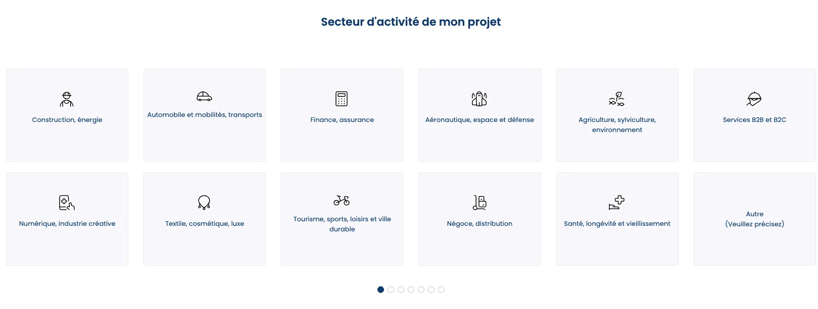
→ Picks their business sector from 12 options in a grid
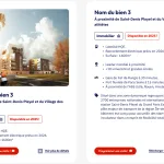
→ Properties displayed as cards
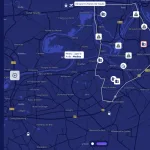
→ Properties displayed on the map. Clicks a listing. Side panel opens with the details.

→ Sees the "Experts who support you" section — CTA to the contact form
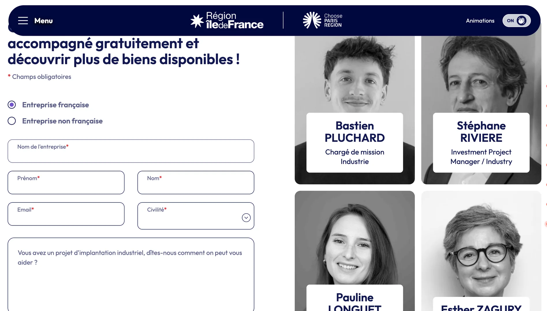
→ Form with real faces of Île-de-France Region experts — reassurance and matchmaking on a single screen
The functional scope and product strategy were framed upstream by Onepoint (scenario 2bis was selected). My role starts where that scope has to become an interface — from component choices to Angular/Tailwind integration, with no gap between design and code, and acting as a facilitator between the client and the technical team on a project with many stakeholders.
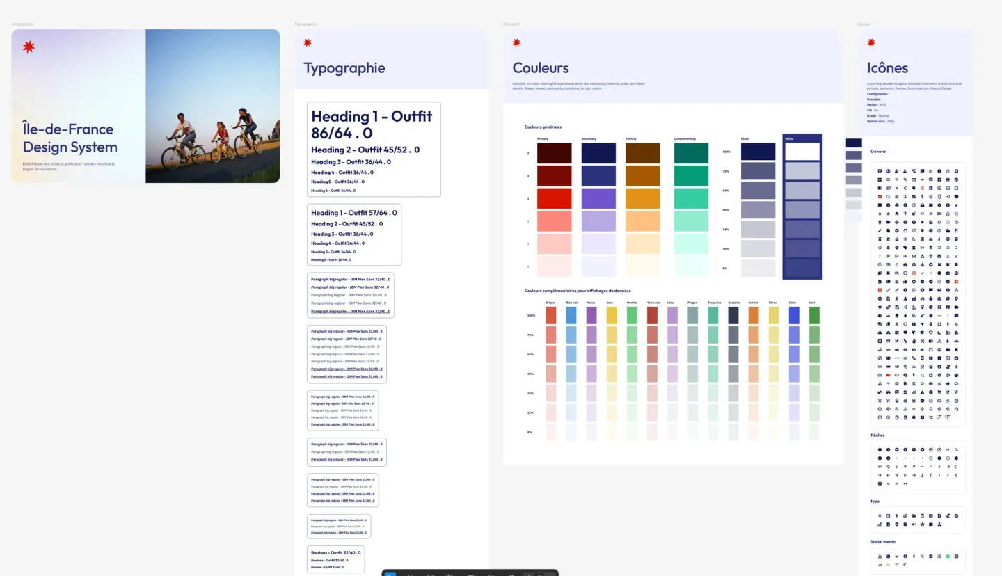
A mandated Design System
The Smart Services / IDF DS was non-negotiable : components, colors and typography set by the Region. Far from being a pure constraint, it structured every UI choice and guaranteed consistency with the wider Île-de-France application ecosystem — without having to reopen the debate on every visual detail.
Fast iterations with UX Pilot, refined in Figma
On complex sections (map + filters, property sheet), UX Pilot made it possible to generate 2-3 directions within minutes. The client could decide based on something concrete rather than a verbal description. Each validated direction was then reworked in Figma — creating new components when needed — for the final, polished, pixel-perfect design.
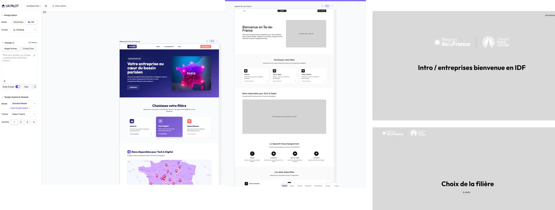
From design to integration via the Figma MCP and Claude Code

Very little negative feedback despite the plurality of stakeholders with diverging interests. On an institutional project involving the Region, its communications team, and partners, that's far from a given. Short iteration cycles let decisions get made quickly, without stalling on political arbitration.
Three decisions that were far from obvious and posed a real dilemma. Here's how I resolved them, and what changed as a result.
5.1 — Costing the visitor under 1 minute to win their attention
Making visitors wait less than 1 minute on arrival runs against usual UX rules.
But without a visual hook, the site remains a tool people pass through and leave quickly.
Yet the target audience includes foreign investors for whom Île-de-France is not yet an obvious choice — "land is too expensive, the industrial ecosystem isn't very visible."
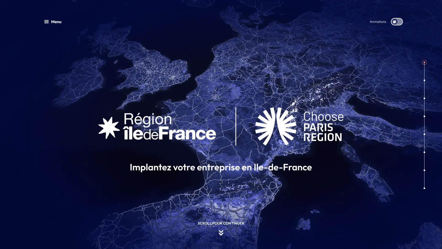
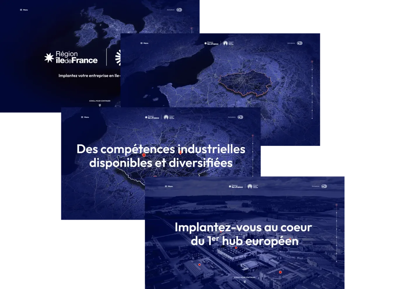
Own the entry delay, but turn it into added value. The GSAP-animated storytelling zooms from the world → Europe → France → IDF in under 1 minute.
By the end of the animation, the visitor is already inside the map — not facing an endless configurator like on the old version. These fast scroll steps become the investment that shifts the perception from "utility tool" to "marketing site."
Users can still choose to skip the animation.
This is also the section where the AI + MCP Figma combination was most useful.
Faster visual validation with the Region's communications team, rather than weeks of debate over static mockups.
The storytelling became as much a political-validation argument as a UX choice.
5.2 — Keeping the map in view, from the first click to the last
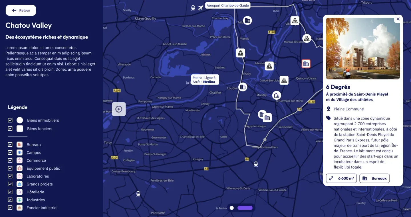
On the old site, two philosophies coexisted and clashed : an upfront filter system (5 steps before seeing any properties), and a search engine that took you out of the map the moment you clicked a listing.
Where to draw the line ?
A two-step compromise: choose a business sector (grid of 12 cards), then land directly on the map with all properties in that sector.
Filters remain in a side panel and optional.
And above all : the property sheet never leaves the context. It opens as a panel inside the map + filters interface.
The map stops being a terminal screen and becomes the center of gravity of the experience.
The logic shifts from "fill in these forms to earn the right to see the properties" to "here are the properties, tell us how we can help you choose."
5.3 — Taking a stand for the human element in an institutional context
A Île-de-France Region site is institutional by nature — neutral, service-oriented, generic forms and footer. Showing team members' faces with first names and roles breaks with a certain conformism.
And so risks a client reaction like "too personal, not official enough." Especially since interviews point to a clear need : "better highlight the Region's role in connecting businesses with territories and its support scheme for companies."
Bring in the real faces of the Île-de-France Region team — first names, roles, photos — directly inside the contact form.
Not a separate section: the contact step is the human moment.
The contact step becomes the natural conclusion of the journey, rather than a forced decision at the end of it.
Client feedback was positive, showing that an institutional site doesn't have to be impersonal, and that trust is also earned through faces.
Factual results
V3 mockup assembled, launch imminent
Region, Region comms team, Institut Paris Region, Medicen, Choose Paris Region
GSAP storytelling validated by the Region's comms team within days via AI/MCP
2 entry points → 1 narrative, property sheet kept in context, marketing journey rebuilt
High satisfaction from the very first iterations on a complex institutional project
Redesign built from the outset to address the 13 non-compliant RGAA criteria and lighten the old site's RGESN footprint
Redesign integrated into the Smart Services IDF visual ecosystem with no break
Three takeaways
01 — A clickable mockup beats a slide. Presenting an interactive version at early project stages short-circuits political arbitration. Stakeholders stop debating abstract principles and start reacting to something concrete.
02 — The map isn't a screen, it's the main interface. Treating a mapping tool as an environment that holds everything (side filters, panel sheets, human support), rather than as a results screen, changes the nature of every downstream UX decision.
03 — Solid upstream scoping frees up design. Onepoint's report had done the hard work : 8 interviews, competitive benchmark, RGAA and RGESN audits, arbitration between 3 strategic scenarios. When the scope arrives locked down, design can focus on its real added value : translating into interface, not re-debating the what.
A collaborative web mapping platform — a digital twin of territory serving two opposite audiences: Siradel’s expert map preparers and end consumers (local authorities, industrial clients).
Three years spent driving UI/UX consistency, building an adaptive design system, and laying the foundations for its open-source release.
| Item | Detail |
|---|---|
| Product | SCE Web (Smart City Explorer) — collaborative web mapping platform for a territorial digital twin |
| Publisher | SIRADEL (formerly an ENGIE subsidiary) |
| Business audience | Internal expert preparers (Siradel teams — data, GIS, business) + external consumers (local authorities, industrial clients — Angers, Val Dauphiné, ex-Monaco…) + external contributors (open-source ecosystem) |
| My role | Lead UI/UX & Front-End Integration |
| Team | PO + Technical & Innovation Director + 2 front-end devs + 1 back-end dev + me |
| Stack | Figma · Figma MCP · Angular · Custom SCSS (formerly Bootstrap) · AI (Claude) · Figma console |
| Timeline | August 2022 → 2026 (ongoing) |
| Design System | Inherited (pseudo-DS in Figma + Bootstrap) in 2022 → tokenized, standalone DS in 2026 |
| Scope | Progressive DS overhaul over 3 years + ongoing product evolution design + laying the groundwork for open source |
| Differentiators | Proprietary Horizon 3D engine · on-map storytelling · multi-format import · SaaS or on-premise deployment |
A positioning between expert and general-public tools, in a market held by well-established players.
SCE operates in a market dominated by ArcGIS (Esri, the expert leader), Felt and Carto (general-public entrants with native collaboration), and Mapbox Studio (technical power for developers).
SCE takes a position between these two worlds: bringing mapping power (3D digital twin, analytical dashboards, territorial storytelling) with accessibility for non-GIS experts.
The mission: make territorial data usable by as many people as possible.
Three guiding lines that shaped 3 years of work
The PO wants a tool that is “simple to use” for operational business users. The Technical Director wants a platform powerful enough for a community of technicians (and, eventually, OSS contributors).
Two structurally opposed audiences, one single UI.
The inherited DS rests on Bootstrap + Angular + a pseudo Figma system.
Three years to evolve it without breaking what works, while integrating the evolutions requested by the PO in parallel.
In 2026, the new leadership wants to better promote the product. That means open-sourcing part of SCE and its ecosystem.
The UI/UX foundations need to be solid enough to carry this shift.
An honest note
The personas and user journey below are partly apost-hoc reconstruction based on feedback from the PO and the Technical Director. On SCE, the product organization did not include systematic user interviews — needs surface through the PO, the preparers, sales demos, and tender feedback.

Anne-Claire,data engineer / GIS specialist, Siradel team

Marc,communications officer, Île-de-France territory
Simplified user journey — Preparer (Siradel)

→ Client data

→ Map styling

→ Dashboards + 3D Horizon

→ Territorial storytelling

→ Dedicated client instance
Simplified user journey — Consumer (end client)

→ Link shared by Siradel

→ Prepared maps, dashboards

→ 2D / 3D / storytelling

→ URL, embed, QR code

→ Internal decision / publication
This is the core of what I bring to SCE. My hybridUI/UX + Front-End Integration profile bridges design and code, and AI has, since 2024, reshuffled the deck.
The workflow built progressively over 3 years
 2022Figma (inherited DS)Handoff → Angular/Bootstrap dev, consistency drift
 2024Figma (tokenized DS)Direct integration (me) → Angular, continuous UI cleanup
 2025Figma + MCP + ClaudeBootstrap break → Angular / custom SCSS, 0 CSS framework
 2026Claude → FigmaReversed workflow (bidirectional MCP) → OSS site foundation (see section 7)
What that changed in practice

I was able to keep shipping evolutions while refactoring the CSS in parallel, without blocking the product or the team.
“Nicolas played an important role in maintaining SCE Web’s UI and UX as it evolved. Setting up a more robust design system after the departure of the designer he replaced strengthened the product’s visual consistency, while making it easier to integrate new features and to collaborate with the development teams.”
Anthony — Technical & Innovation Director, Siradel
three decisions that helped gain flexibility for both the map preparer and the end user.
5.1 — Two views as an answer to the double audience
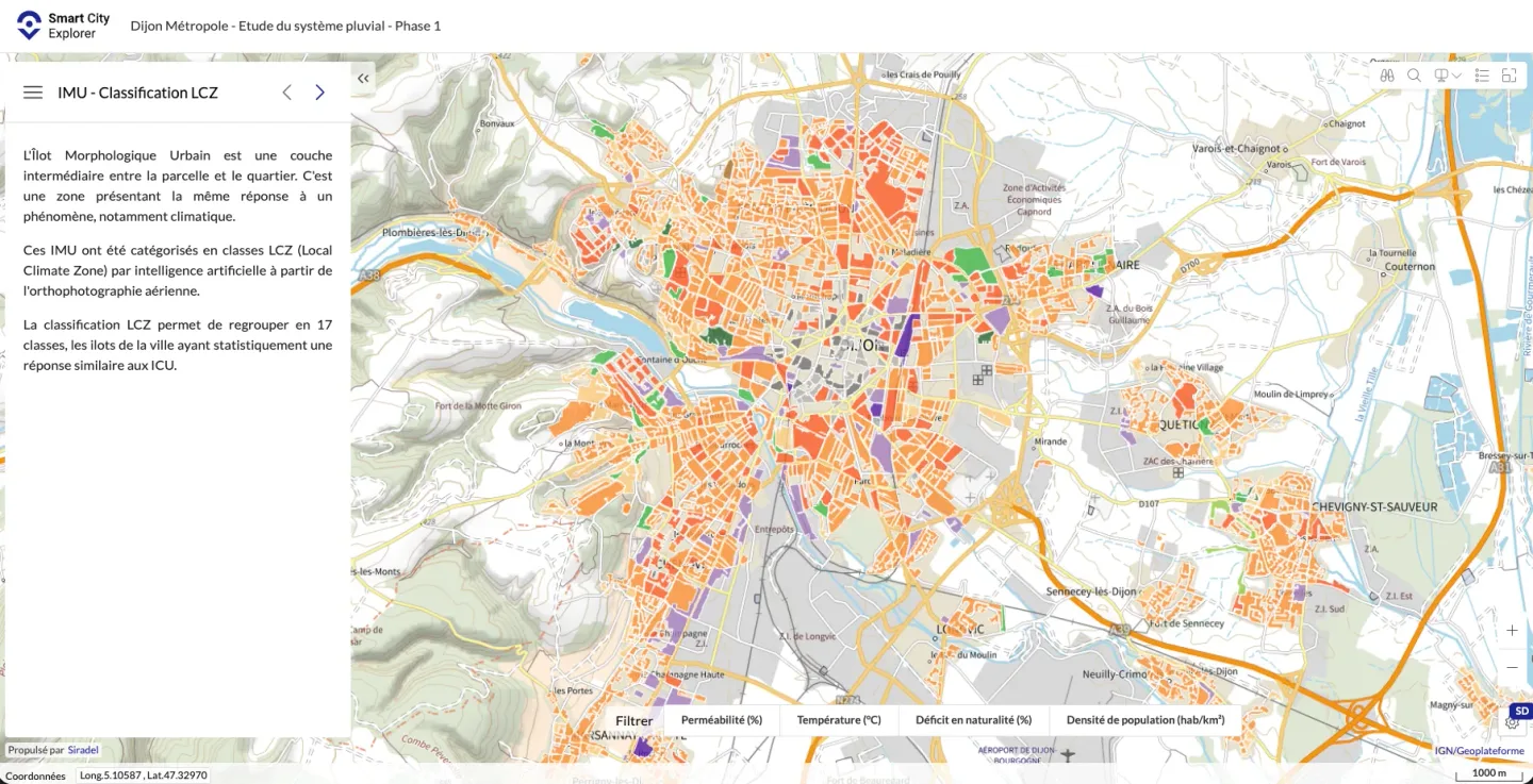
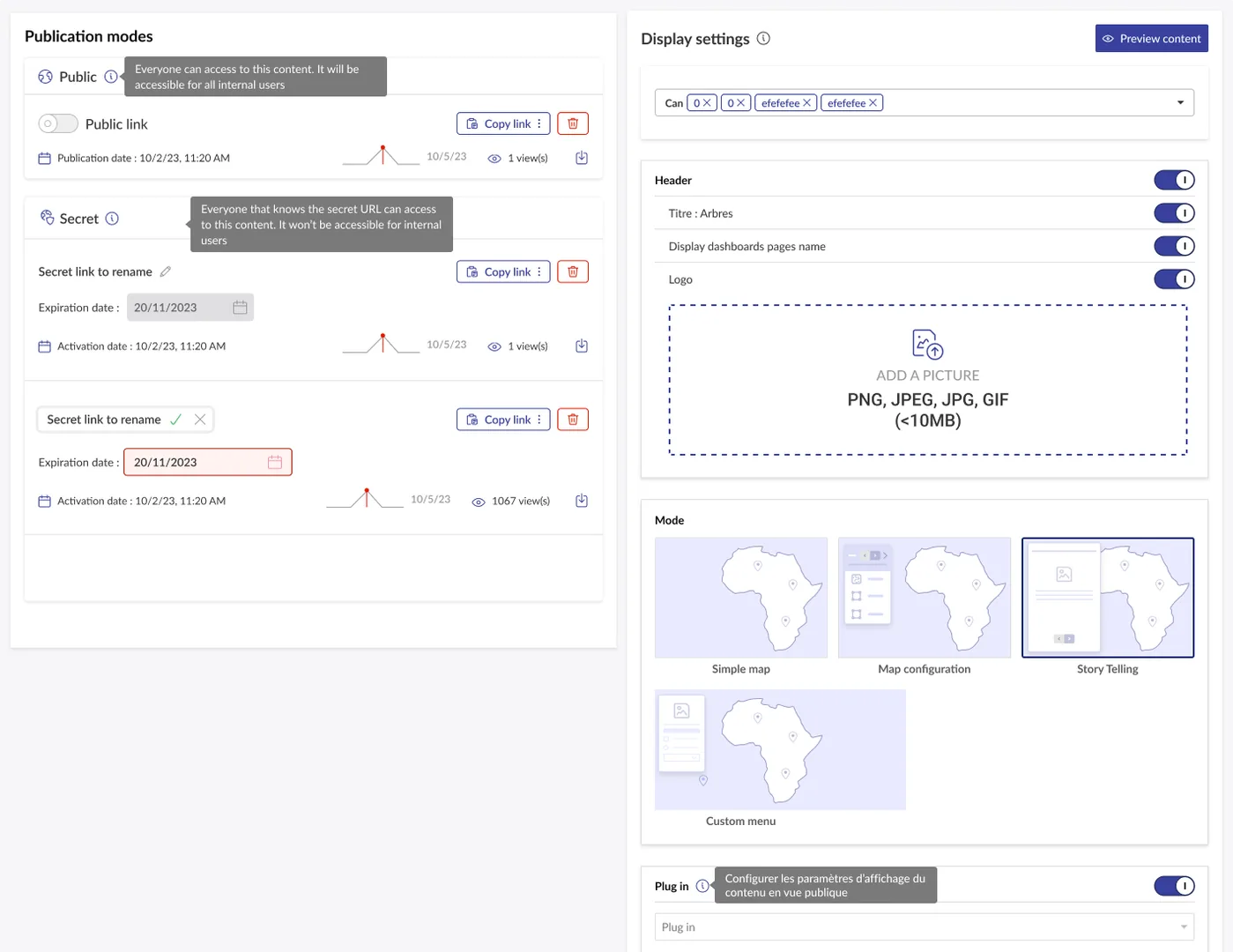
SCE has to serve, within a single web interface, both an expert preparer (Siradel team or power-user client, long sessions, multiple screens) and an end consumer (elected official, communications officer, sometimes on a tablet during a council meeting).
Competitors split this into two separate applications (ArcGIS Pro vs ArcGIS Online).
SCE holds both in one. More efficient for the team, but noticeably harder to design.
Two modes embraced within the same UI: high-density editing for the preparer, streamlined publication for the consumer.
On the publication side, designed with the product owner around 4 visual presets — chosen in one click:
The preparer doesn't have to rebuild the display every time.
The consumer gets a clear view, with no inherited admin-UI baggage.
The preparer stops leaving the product to assemble what the product itself already produced.
And the admin UI becomes usable by some advanced clients — which wasn't viable before the DS overhaul.
5.2 — The native interactive legend
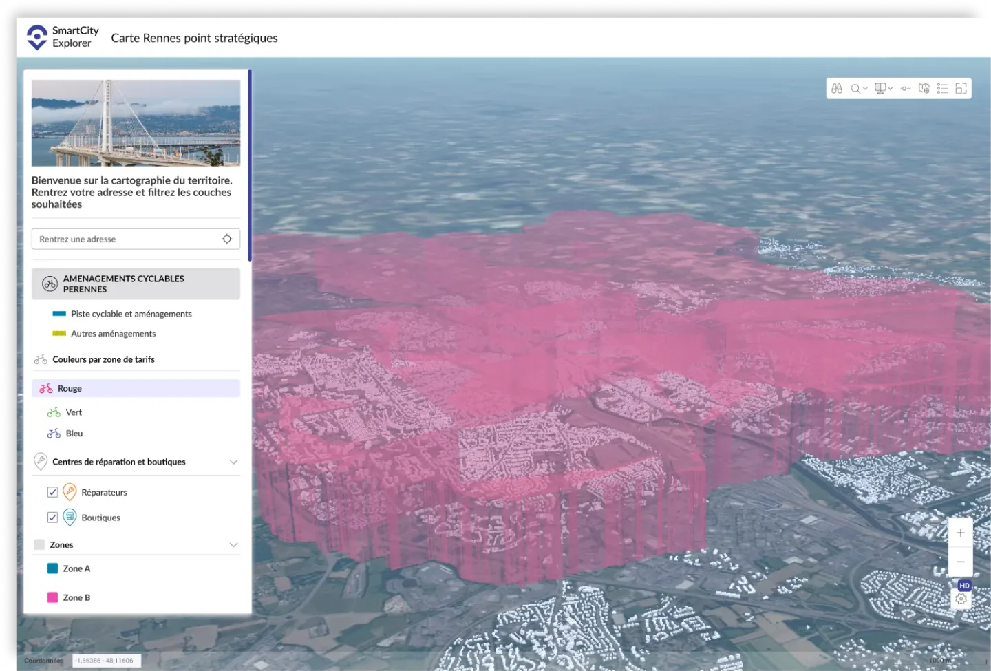
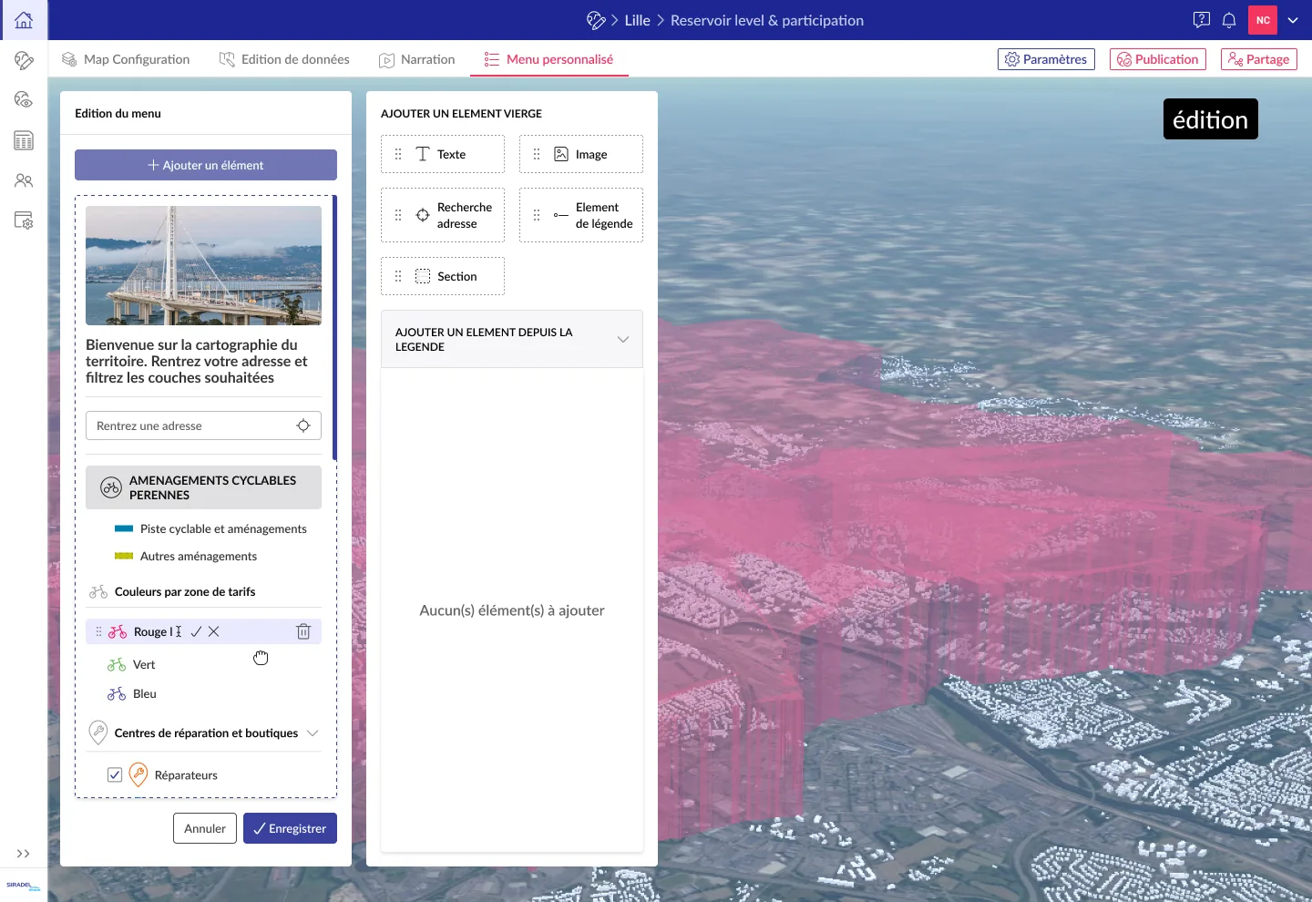
Including a map's legend in a dashboard required manual display conditions — a cumbersome task that pushed people to show everything just to avoid the complexity.
On a product that aims to be accessible, that’s a frustrating signal that the building blocks are still too tightly coupled.
A native legend component that plugs in directly — you choose what to show, with a clean UI on both sides: editing and publication.
The consumer gets a clear view, with no inherited visual baggage from the admin UI. The preparer stops leaving the product to assemble what the product itself already produced.
The admin UI becomes usable by some advanced clients (file uploads, dashboard creation) — which wasn't viable before the DS overhaul.
5.3 — Navigation axes, the pivot of the map ↔ widget dialogue
In most mapping products, the map and the statistical widgets (pie charts, histograms, KPIs) coexist without talking to each other.
Filtering the map doesn't filter the widgets, and vice versa. ArcGIS Dashboards, Carto, Tableau — they all share this pain point.
The Navigation axes— a unified filter bar that drives the map and every dashboard widget simultaneously. Click → live update everywhere, at the same time.
Designed as DS components, they adapt to context (attribute picker, date picker, multi-value).
The preparer stops configuring 30 filters across 30 widgets — one axis drives everything. The consumer explores by clicking, with nothing to learn.
And it's a concrete argument in a demo or a tender: “here is the projected impact of the project on the district, filtered by usage”. SCE becomes a system where the components talk to each other.
“Nicolas allowed me to quickly translate my product vision into visuals and user journeys. I sketch an idea quickly in Figma and Nicolas picks it up to enrich it and polish it. His responsiveness let us ship the evolutions needed for certain tenders on time. Being able to integrate his designs into the solution also helped clean up the UI of raw development work.”
Antoine — Product Owner, SCE Web, Siradel
Factual results
Inherited pseudo-DS → tokenized, standalone DS with no framework dependency
Since 2025 — clean console, custom CSS classes, elastic DS
Validated by the PO as a direct business-impact channel (tenders)
The UI hasn’t drifted despite ~35 evolutions shipped over the period
No design/integration handoff, continuous UI cleanup of raw development work
OSS DS rebuilt in 2026 with a reversed Claude → Figma workflow
Three lessons
01 — On a niche product, the designer acts as supervisor and orchestrator. The work consists of preventing drift, maintaining quality as evolutions pile up. It's rarely visible, but it's what makes the next commercial phase possible.
02 — The hybrid profile pays off on products where you don’t want to multiply handoffs. The team is compact (5 people). The hybrid profile compresses design → handoff → integration and lets a PO turn an idea into a shipped evolution within the month — when a tender demands it.
03 — AI doesn’t replace, it reshuffles what you do. In 2022, I would have dragged Bootstrap along for two more years. In 2025, I broke it because AI absorbed the mechanical part. In 2026, I no longer draw my DS: I prompt it and validate it. The role shifts toward prompt editing, quality arbitration and system upkeep.
Siradel’s recent acquisition brings new momentum: leadership wants to invest in SCE and promote it better. Open-sourcing part of the ecosystem is underway — building a technical community around the product, and using the commercial SaaS as a monetization model for advanced needs.
Building the SCE ecosystem’s open-source sites with an AI-automated design system
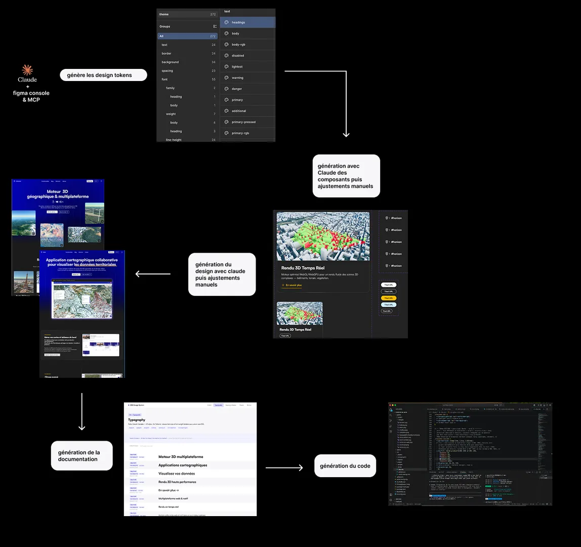
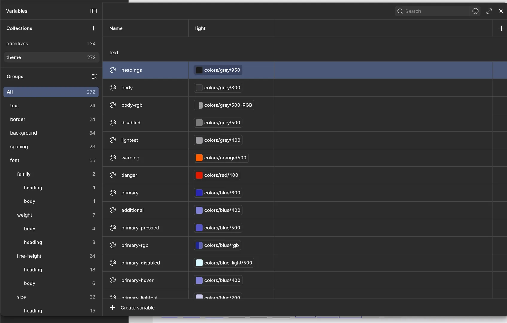
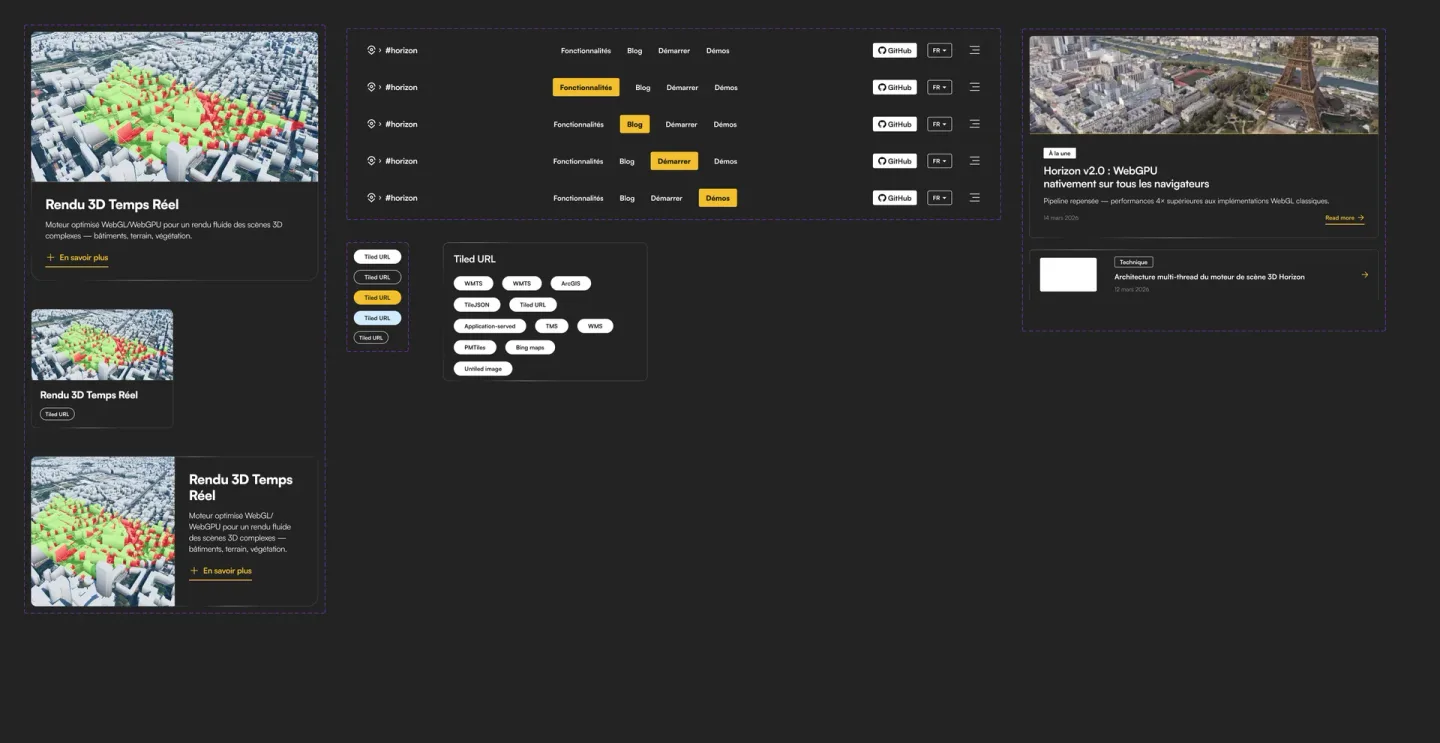
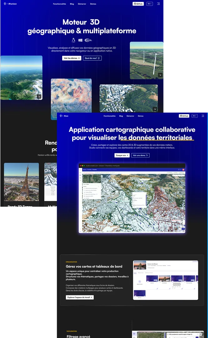
For the open-source ecosystem’s DS, Claude autonomously generates the tokens and components, then populates Figma as the visual output.
On the code side, I have it make a few adjustments based on developer feedback: making components more easily editable with a slot system. This allows for deeper customization without having to recreate new ones.
The importance of .md files

I create a claude.md file to help it avoid the most common mistakes (hard-coded values, applying Tailwind classes with@apply in the CSS, component structuring…) and I keep it updated as the work progresses.

Dedicated skills applied to optimize the code (before developer review) and for WCAG accessibility (before QA testing).

A design.md file captures the visual decisions: active tokens, per-component guidelines, typographic choices and spacing rules. It acts as the source of truth so Claude keeps the Figma → code consistency without drifting across iterations.
The benefit
“This work will make even more sense once SCE goes open source, delivering a product with UI/UX foundations already firmly in place.”
Anthony — Technical & Innovation Director, Siradel
Got a project, an idea, or a collaboration in mind?
I'm available to talk it through and bring your ambitions to life.
Don't hesitate to reach out, I'd be glad to chat.
 Email me